Chrome on iOS is drastically dumbed down. Other than for the cross-platform synchronization features that it brings to the table, Google’s browser is pretty limited in terms of customization. When compared to Safari, even the theme that Chrome uses leaves a lot to be desired — in fact, it looks quite dated and boring.
But not any longer. A recent Chrome update for iOS has brought a host of radical design changes, and if you hate the current theme of the browser, the new UI should feel very welcome. Looks like the much talked-about Material Design changes are finally available on iOS. Phew.
However, Google hasn’t really made the new UI the standard default on Chrome, hence you need to manually enable it with a minor tweak in the browser’s experimental settings panel.
So, let’s go ahead and ditch the current theme for good.
Enabling the Theme
The new Material Design UI, dubbed ‘UI Refresh Phase 1,’ is only available on Chrome version 68 (or higher) for iOS. So, do make sure to update your browser to the latest version via the App Store before proceeding.
To start off, get to Chrome’s experimental settings panel. To do that, type chrome://flags into the URL bar of a new tab, and then tap Enter.
On the Chrome Experimental Features screen, type Refresh into the search box. You should see an option labeled UI Refresh Phase 1 appear to the top of the screen. Use the pull-down menu next to it and select Enabled.

To apply the changes, you need to force-quit the app — simply double-tap the Home button and swipe the Chrome app card upwards. On iPhone X, however, you need to swipe up from the bottom of the screen to get to the app switcher, and then tap and hold down on the Chrome app card briefly — after that, tap the red-colored icon.
Once you’ve force-quit Chrome, simply relaunch it to check out the browser in all its newfound glory.

Looks vastly different now, doesn’t it?
So, What Has Changed?
As you can see, a ton of things have changed. Instantly noticeable are the rounded curves of the search bar, buttons, and icons, all of which now feel quite modern, much larger, and more pronounced. Even the colors are no longer drab or dull-looking, and they really pop out when you open a new tab for the first time.
You can also see a bunch of new icons labeled Bookmarks, Reading List, Recent Tabs, and History listed just under your list of frequented sites. Should come very handy in getting to those locations much faster.

Next in line, you should see huge changes to the navigation options, which are now listed to the bottom of the screen. While the URL bar is still located at the top, the ability to go back or move forward without having to stretch your thumb all the way to the top feels refreshing.

Furthermore, the position of the URL bar doesn’t matter one tiny bit either. No longer do you have to tap it to begin searching — just use the new search icon and you are good to go. It was always uncomfortable having to use the URL bar, especially when you’ve already got a site loaded, hence this new addition to Chrome is a major improvement.
Even switching between tabs feel easier — the numbered icon that brings up the tab switcher is now comfortably present at the lower-right corner of the browser. Better yet, tapping it opens up your tabs in thumbnail-format — highly reminiscent of the iOS app switcher itself — instead of the usual drawer, which makes locating and selecting whatever tab you want a breeze.
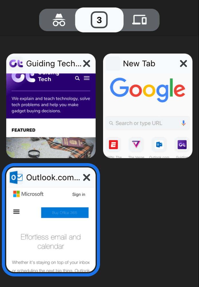
From the tab switcher, you can now instantly move to Incognito mode with a swipe to the left, while checking out your list of synced devices involve a swipe to the right.
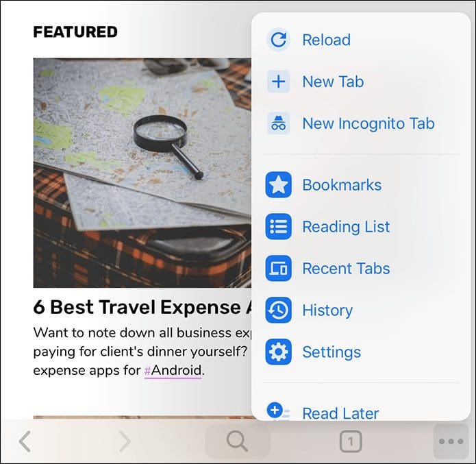
What about the Chrome menu? Well, it has had a visual overhaul as well. You should see items within now displayed in a bluish color, complete with relevant icons next to each listing. And just like the tab-switcher, it’s placement at the lower edge of the screen makes opening it a no-brainer.
Sadly, the Settings panel is still the same dull looking list of options that was present before, which is understandable since the UI update hasn’t gone mainstream yet. Also, expect certain other elements such as the History and Bookmarks pane to look and function just the same.
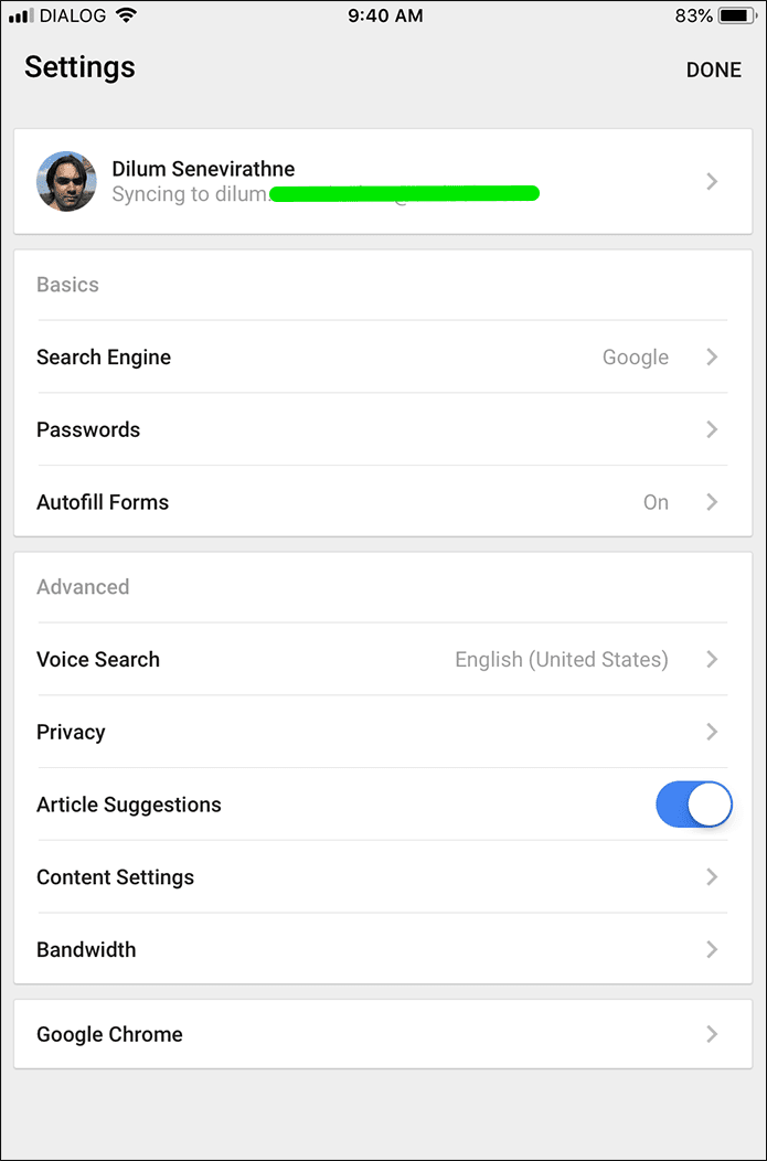
In a nutshell, anything that isn’t visible at first glance is likely to look similar to the default Chrome theme.
On the iPad
If you use an iPad, you can switch to the new UI using the same procedure. And from a basic standpoint of view, the changes look even more prominent due to the presence of the desktop-like tabs, which now sport rounded edges.
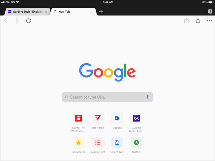
But aside from that, you likely won’t find any improvements in terms of navigation — unless you use Chrome in split-view mode, in which case the search and tab switching icons move to the bottom of the screen just like on iPhone.
So, What are You Waiting For?
Thanks to the new design update, Chrome looks and functions better than ever before. The navigation and search options to the bottom of the screen alone makes for a huge difference, and should allow for faster searching and tab-switching.
However, don’t forget that the entire design is still in an experimental phase. At times, you may notice a few anomalies where certain web elements won’t render properly. If that hinders you from browsing normally, consider switching to back to the default theme until Google irons out the bugs on this one.
Was this helpful?
Last updated on 03 February, 2022
The article above may contain affiliate links which help support Guiding Tech. The content remains unbiased and authentic and will never affect our editorial integrity.


